MSU Graduate Spatial Ecology Lab 4
Phoebe Zarnetske: plz@msu.edu; Lala Kounta: kountala@msu.edu; Kelly Kapsar: kapsarke@msu.edu
Last rev. Sep, 2025; created Sep, 2020
Lab 4: Spatial Autocorrelation (Moran’s I, Mantel Test)
This lab has 2 Parts. You need to hand in Part 2 as a single PDF produced from R Markdown, including output plots, statistics, code, and text for answers to the questions below. When referring to the code below it may be more useful to use the .Rmd file linked above. OPTIONAL: If you would like to test out GitHub in completing this lab, complete your .Rmd file in RStudio and push your PDF (and your .Rmd if you want) to a repository. You can add the link to the GitHub file when you submit to D2L. Please also submit your PDF to D2L.
This lab uses the brycesite environmental data from the R package labdsv.
The variable list for the site variables is here: https://www.rdocumentation.org/packages/labdsv/versions/2.1-2/topics/brycesite. A few notes: east=easting; north=northing; elev is recorded in feet; we will convert to metric.
These data come from a vegetation survey in Bryce Canyon National Park, Utah. It’s an amazing place with unique formations! For more about Bryce Canyon see: https://www.nps.gov/brca/index.htm

https://upload.wikimedia.org/wikipedia/commons/4/4d/USA_10654_Bryce_Canyon_Luca_Galuzzi_2007.jpg
Part 1: More practice plotting spatial data
Start working in R:
##### STARTING UP R
# Clear all existing data (or don't and just make sure you start with a newly opened RStudio session; see why this may not be so great for reproducibility: https://rstats.wtf/save-source.html#rm-list-ls)
rm(list=ls())

# Close graphics devices
graphics.off()

# Set the paths for your work
output_path<-("output")
# if this folder doesn't exist, create it
if(!dir.exists(output_path)){
  dir.create(output_path)
}

# Create the folders (directories) "data" and "lab4" - If they exist already, this command won't over-write them.
data_path<-(file.path("data","lab4"))
if(!dir.exists(data_path)){
  dir.create(data_path,recursive = TRUE)
}
If you previously saved your workspace and want to load it here, do so this way:
load(file.path(output_path,"lab4.RData"))
NOTES on R packages used in this lab:
- With R Markdown, it is helpful to install packages locally before knitting. (copy this into your R console before you knit).
for (package in c("sf","dplyr","ape","labdsv","gt","ncf,"Feddata","terra",ggplot2","ggspatial","tmap")) {
if (!require(package, character.only=T, quietly=T)) {
install.packages(package)
library(package, character.only=T) } `} Load
the packages:
library(sf)
library(dplyr)
library(ape)
library(labdsv)
library(gt)
library(ncf)
library(FedData)
library(terra)
library(ggplot2)
library(ggspatial)
library(tmap)

# Apply ggplot2 theme to remove gray background and set the base font size as 14. See: # https://ggplot2.tidyverse.org/reference/ggtheme.html for more theme options.
theme_set(theme_classic(base_size = 14))

# Call the data directly because it's loaded in the labdsv R package
data(brycesite)

# Plot the data in space, by elevation (brycesite has northing and easting so
# it's projection is UTM). Here we will use the sf R package.
head(brycesite)
site <- brycesite %>%
  tidyr::drop_na(east, north) %>% # drop missing locations
  mutate(elev_m = elev * 0.3048) # create new column; convert feet to meters

class(site)
sf::st_crs(site) # CRS for site doesn't exist because it's a dataframe (not spatial feature)

# Define CRS using the sf package
# We're using UTM Zone 12 because the labsdv specifies that brycesite east and north
# values are in UTM and the appropriate UTM zone for Utah is Zone 12
crs.geo <- sf::st_crs("+proj=utm +zone=12 +datum=WGS84")

# Make site into a spatial feature using sf package; assign its projection
site <- site %>%
  sf::st_as_sf(coords = c("east", "north"),
crs = crs.geo)

# Now we've coverted it into a spatial object
class(site)

# Plot it with ggplot
site %>%
  ggplot(aes(color = elev_m)) + geom_sf() +
  scale_color_viridis_c(option = "viridis",
                        name = "Elevation (meters)")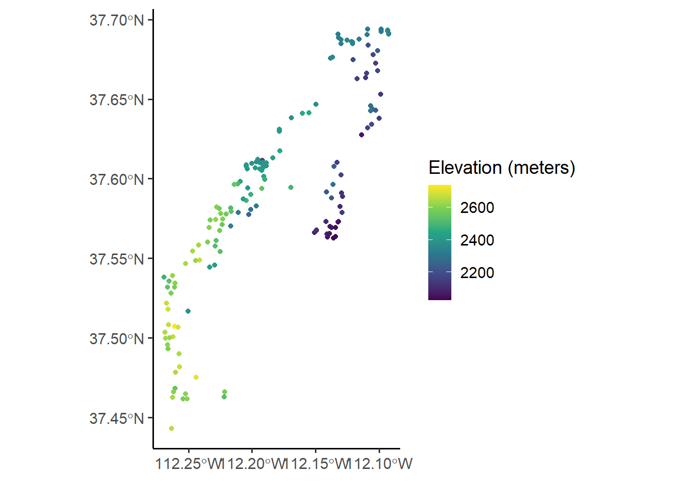
# Plot it with tmap
# tmap
tm_shape(site) + tm_bubbles(palette = "viridis",
             col = "elev_m",
             size = 0.25)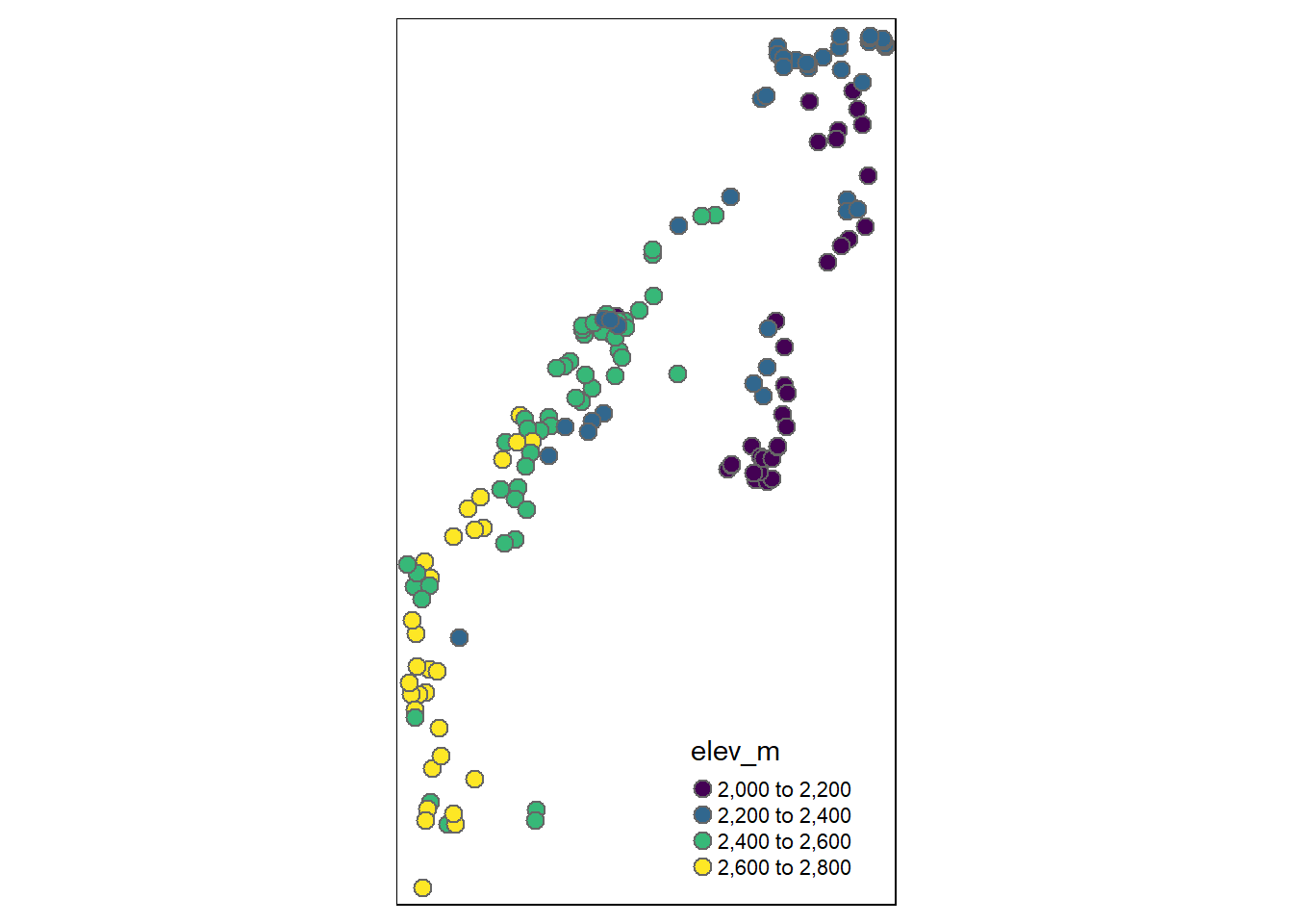
# Take a look at the underlying elevation from the National Elevation Dataset (NED)
# using the FedData R package. The FedData package works best if you use a spatial
# object created with the sp package.
site.sp<- as(site, "Spatial")

# Returns a raster
NED <- get_ned(
  template = site.sp,
  label = "bryce"
)

# If you have trouble with FedData package, the Lab4_NED data are on D2L in
# Lab 4's    # section as "Lab4_NED.RData". Simply save it, and open it in R.
Plot the elevation raster and the vegetation data plot locations on the same map. Practice using ggplot2 for this plotting. First, project the shapefile (site, which is vector data) using the CRS of the raster (NED). You should avoid projecting raster data, as projecting it affects the cell values.
# Define crs using the sf package
site.m <- sf::st_transform(site, crs=terra::crs(NED))
# Create a dataframe out of the NED raster. This is a necessary step for
# plotting rasters using geom_raster from ggplot2.
NED_df1 = as.data.frame(NED, xy = TRUE)
head(NED_df1)
NED_df1 <- NED_df1 %>%
  tidyr::drop_na()
# Rename the elevation column
NED_df <- NED_df1 %>%
  rename(elev_NED = USGS_1_n38w113)
# Plot the NED with the points overlaid using ggplot. See how the elevation in
# the points aligns with the NED
ggplot() +
  geom_raster(data = NED_df,
aes(x = x, y = y, fill = elev_NED)) # x and y are defined as the column names, 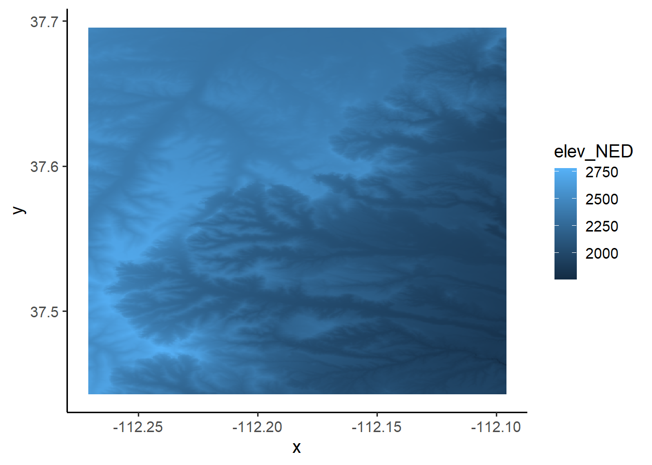
# "x" # and "y"; "elev_NED" is the elevation column

# Now add on the vegetation plots and their associated elevation from the elevdat data,
# and change the color of the raster.
NED_elev <- ggplot() +
  geom_raster(data = NED_df, aes(x = x, y = y, fill = elev_NED)) +
  geom_sf(data = site.m, aes(color = elev_m)) +
  scale_fill_viridis_c(option = "viridis",
    name = "NED Elevation (m)") +
    scale_color_viridis_c(option = "plasma",
                         # direction = -1,
    name = "Plot Elevation (m)") +
  annotation_scale(location = "br",
    width_hint = 0.5) +
  annotation_north_arrow(location = "br",
    which_north = "true",
    pad_x = unit(0.75, "in"),
    pad_y = unit(0.5, "in"),
    style = north_arrow_orienteering) +
labs(title = "Bryce Canyon Vegetation Plot Elevation") +
  ylab("Latitude") +
  xlab("Longitude")
NED_elev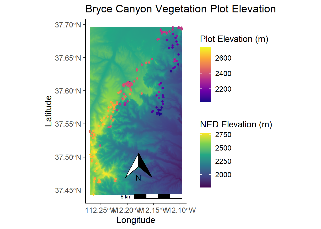
# Plot with tmap:
tm_shape(NED) +
tm_raster(alpha = 0.75, legend.show = FALSE) +
tm_shape(site.m) + tm_bubbles(palette = "viridis",
               col = "elev_m",
               size = 0.25)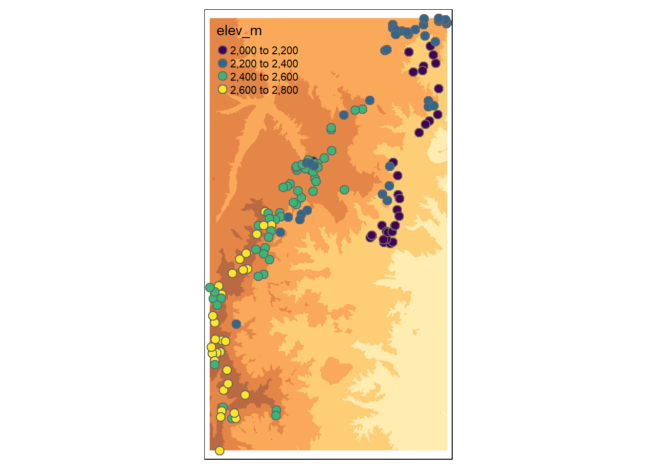
Part 2: Moran’s I
Moran’s I in package ape
Check assumptions about the elevation data; an assumption of the Moran’s I test is that data are normally distributed. Determine whether data should be transformed. Some transformations to consider: square-root, log.
hist(site$elev)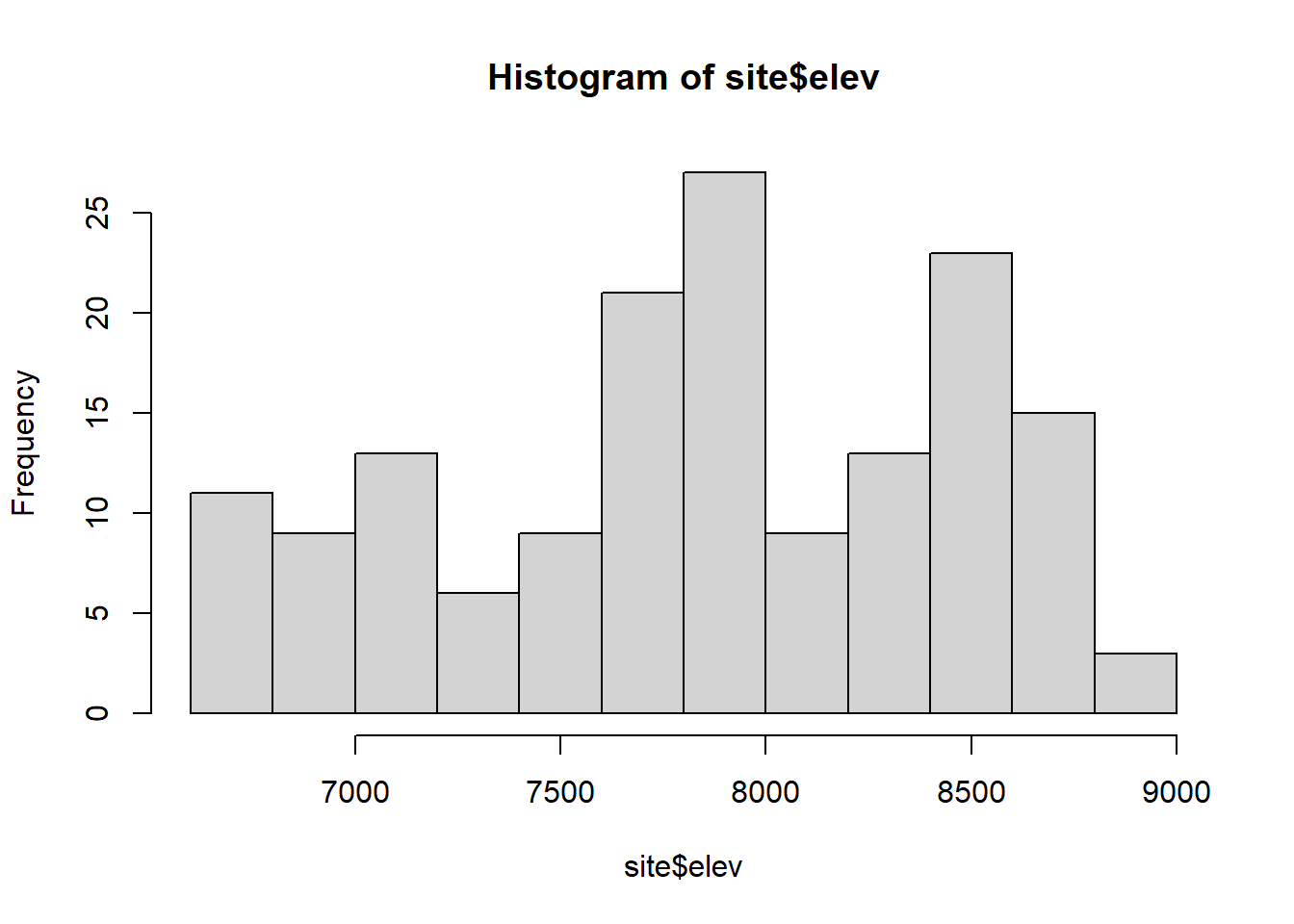
shapiro.test(site$elev)##
## Shapiro-Wilk normality test
##
## data: site$elev
## W = 0.95485, p-value = 5.093e-05qqnorm(site$elev)
qqline(site$elev,col="blue")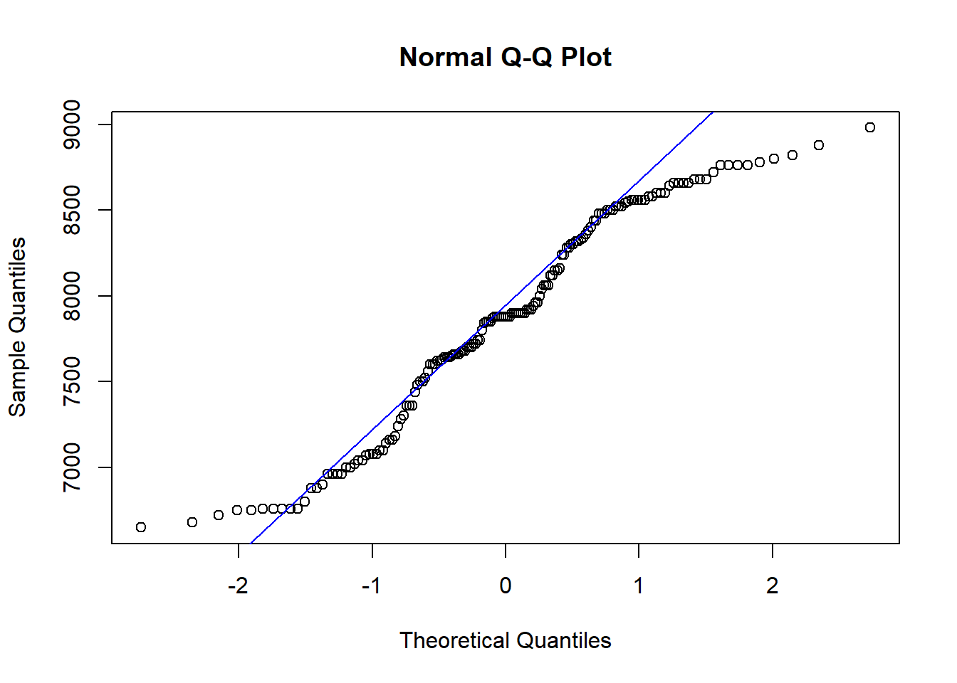
shapiro.test(log(site$elev))##
## Shapiro-Wilk normality test
##
## data: log(site$elev)
## W = 0.94937, p-value = 1.689e-05qqnorm(log(site$elev))
qqline(log(site$elev),col="red")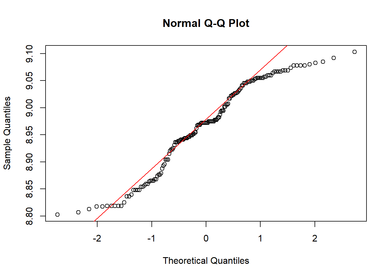
site$log.elev <- log(site$elev)

# Tidy up the output; use broom and gt packages
shap_test_elev <- broom::tidy(shapiro.test(site$elev_m))
shap_test_elev %>%
  gt() %>%
gt::tab_header(title = "Shapiro Test (elevation)")| Shapiro Test (elevation) | ||
| statistic | p.value | method |
|---|---|---|
| 0.9548468 | 5.092745e-05 | Shapiro-Wilk normality test |
shap_test_lelev <- broom::tidy(shapiro.test(log(site$elev_m)))
shap_test_lelev %>%
  gt() %>%
gt::tab_header(title = "Shapiro Test (log elevation)")| Shapiro Test (log elevation) | ||
| statistic | p.value | method |
|---|---|---|
| 0.9493736 | 1.689473e-05 | Shapiro-Wilk normality test |
# You can combine them into 1 table like this:
shap_test_df <- data.frame(var = c("elev_m", "log_elev"),
  statistic = c(shap_test_elev$statistic, shap_test_lelev$statistic),
  p.value = c(shap_test_elev$p.value, shap_test_lelev$p.value))

shap_test_df %>%
  slice(1:2) %>%
  gt() %>%
gt::tab_header(title = "Shapiro Test Results")| Shapiro Test Results | ||
| var | statistic | p.value |
|---|---|---|
| elev_m | 0.9548468 | 5.092745e-05 |
| log_elev | 0.9493736 | 1.689473e-05 |
# add easting and northing column to site_sf object
site_coords <- site %>%
  st_as_sf()%>%
  sf::st_coordinates()

site <- site_coords %>%
  bind_cols(site)

# Compute distance matrix
data.dist <- as.matrix(dist(cbind(site$X,site$Y)))

# Check the maximum distance within the site (units = meters)
max(data.dist)
## [1] 31583.48# Create an inverse distance matrix
w <- 1/data.dist
diag(w) <- 0
# Histogram breaks & counts
hist(data.dist)$breaks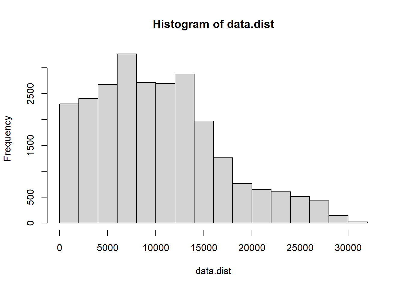
## [1] 0 2000 4000 6000 8000 10000 12000 14000 16000 18000 20000 22000 24000 26000 28000 30000 32000hist(data.dist)$counts## [1] 2303 2406 2674 3262 2710 2698 2874 1968 1260 762 644 606 512 432 146 24# Plot the distance matrix with one option of Distance classes
# (note: these may not be the most informative classes)
hist(data.dist,
main="Histogram of distances with classes chosen",
xlab="Distance (meters)",
col="gray",
ylim=c(0,4500))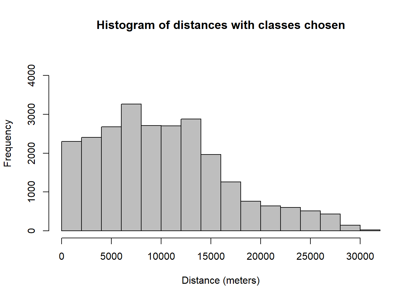
abline(v=hist(data.dist)$breaks,
       col="purple",
       lwd=2)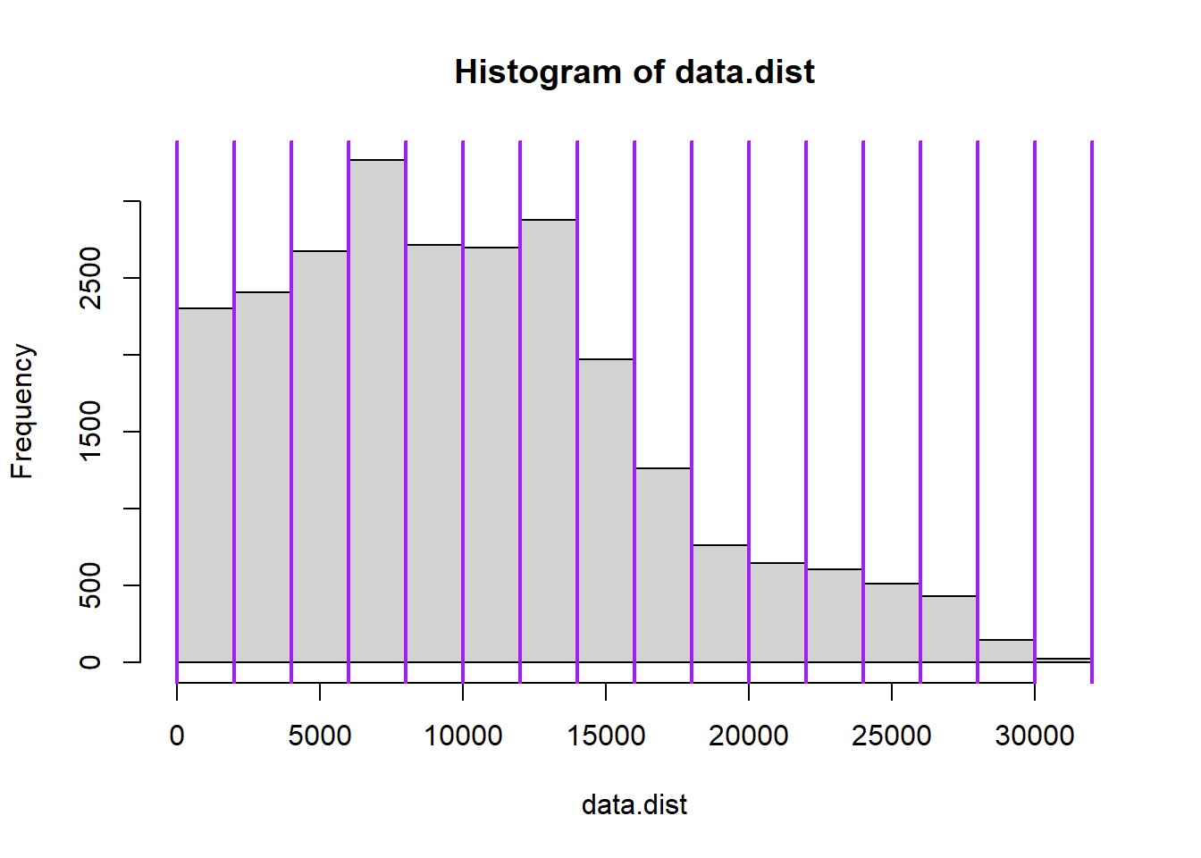
#Compute Moran's I
ape::Moran.I(site$log.elev, w, scaled = T, na.rm = T, alternative = "two.sided")
## $observed
## [1] 0.5036994
##
## $expected
## [1] -0.006329114
##
## $sd
## [1] 0.01934851
##
## $p.value
## [1] 0ape::Moran.I(site$elev, w, scaled = T, na.rm = T, alternative = "two.sided")## $observed
## [1] 0.5048929
##
## $expected
## [1] -0.006329114
##
## $sd
## [1] 0.0193532
##
## $p.value
## [1] 0QUESTION 1:
Interpret Moran’s I results. Is there a more appropriate form of elevation data (transformed or non-transformed) for this test?
Next, create a Correlogam for Elevation using correlog
from the ncf package using a specific increment for
distance classes (here shown with 1000m increments; use a different
distance class in your example).
cor.elev <- ncf::correlog(site$X, site$Y, site$elev, increment = 1000, resamp = 100)
plot(cor.elev$correlation, col = "blue")
abline(h = 0, col = "purple")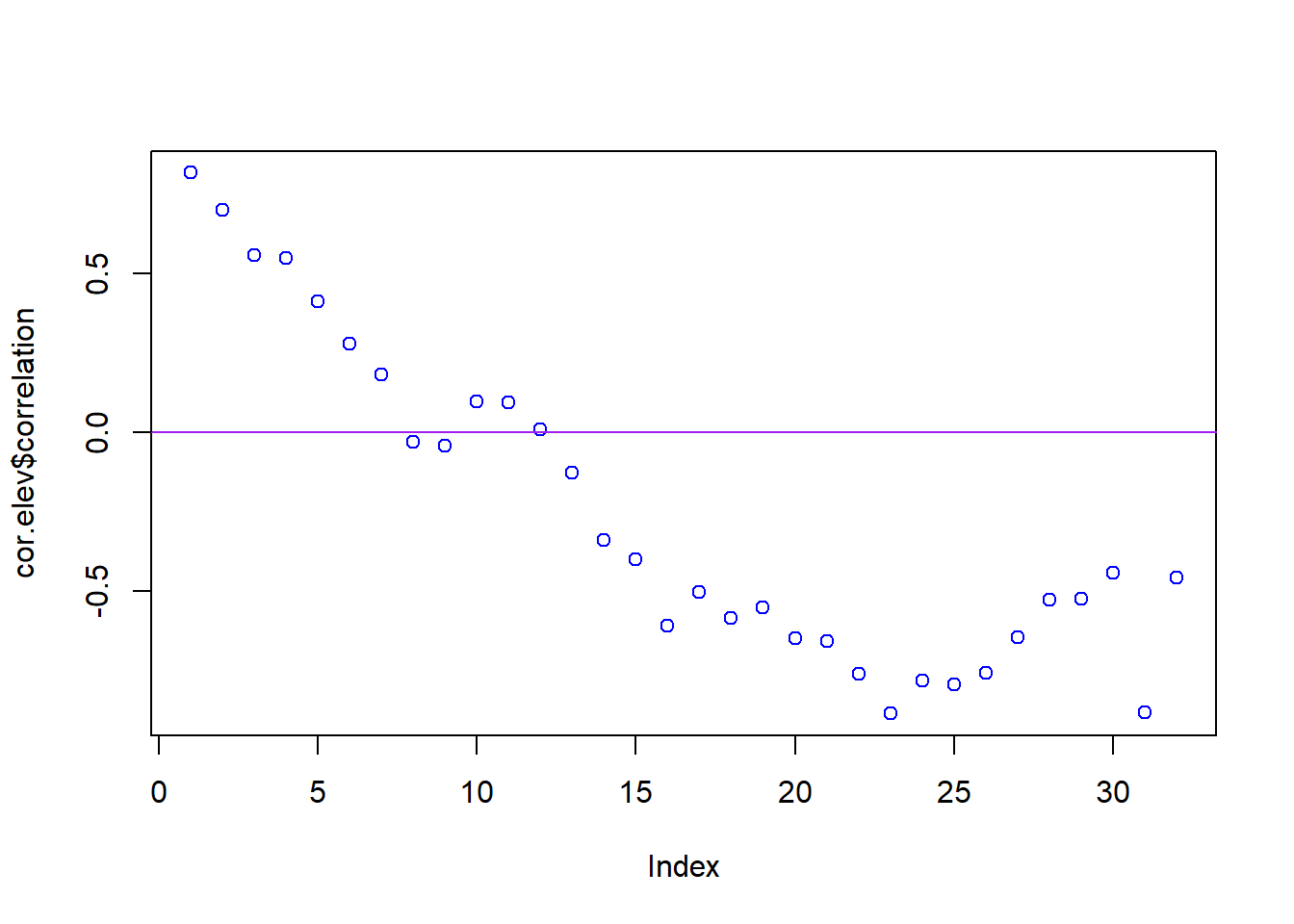
cor.lelev <- ncf::correlog(site$X, site$Y, site$log.elev, increment = 1000, resamp = 100)
plot(cor.lelev$correlation, col = "red")
abline(h = 0, col = "purple")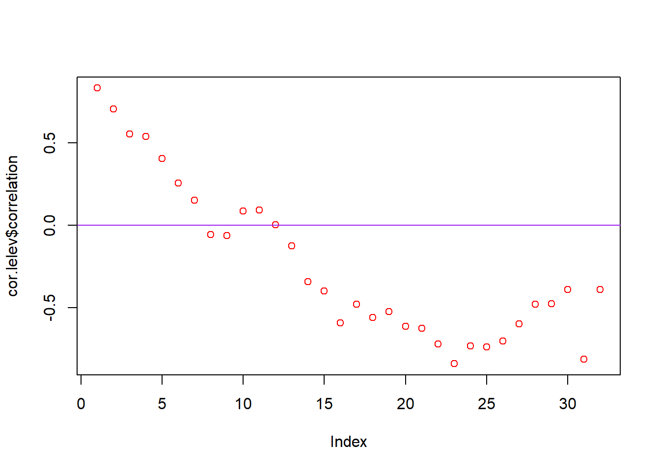
fit <- invisible(cor.elev)
#How many classes are significant by alpha = 0.05?
length(which(fit$p <= 0.05))

plot(fit$mean.of.class, fit$correlation, pch = 19, "black", ylab = "Correlation coefficient", xlab = "Distance (mean of class)", main = "Correlogram for elevation change")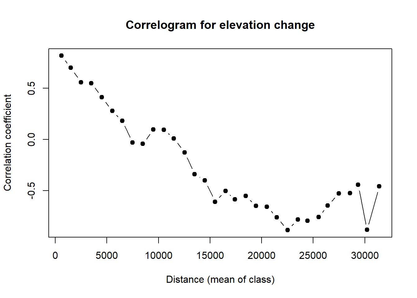
# You can also try other R packages like pgirmess, to make correlograms (note that the # function has the same name "correlog" in both R packages; you need to specify which
# one to use).
pgi.cor <- pgirmess::correlog(coords=site_coords, z=site$elev, method="Moran", nbclass=20)
plot(pgi.cor)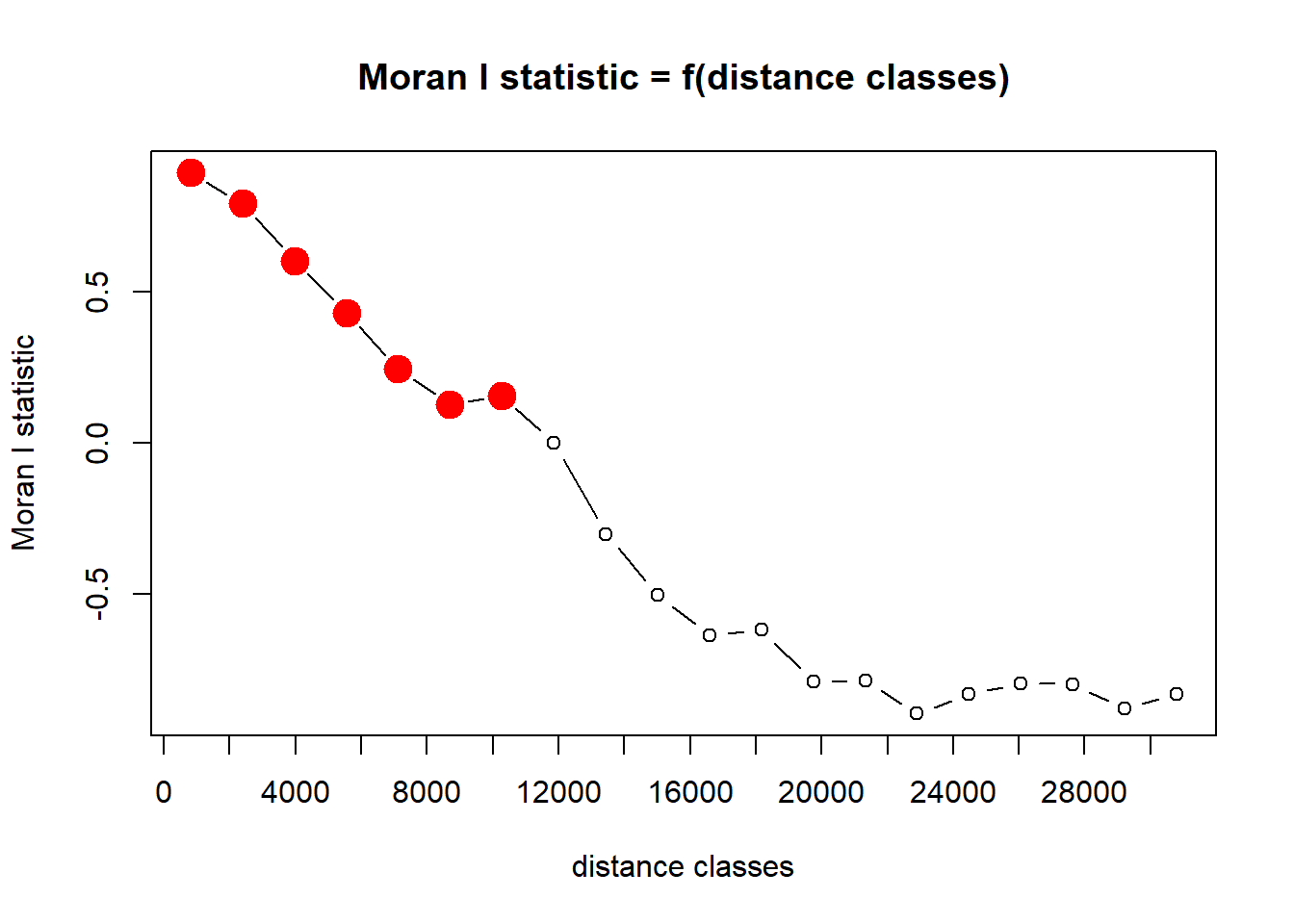
QUESTION 2:
Plot and interpret your correlograms. What does the correlogram demonstrate about the autocorrelation pattern in the data? Explain your choice of Distance Classes and how it could affect the results.
QUESTION 3:
Perform a statistical test to determine if your peaks are
significant. Hint: look at your correlog output and the
instructions for the correlog function in the reference
manual for the pgirmess package. Which ones are significant?
Next, choose a NEW VARIABLE from the brycesite
dataframe. Plot the variable in space (see the code for plotting
elevation on a map, above). The variable list for the site variables is
here: https://www.rdocumentation.org/packages/labdsv/versions/2.0-1/topics/brycesite.
QUESTION 4:
What are the general patterns of the NEW VARIABLE across space? What kind of spatial autocorrelation structure do you predict you will see in the correlogram and what biotic or abiotic process(es) may play a role in generating this structure?
QUESTION 5:
Make a correlogram and run a Moran’s I test to look at spatial autocorrelation structure of the new variable. Interpret the results of the Moran’s I tests relative to your predictions from Question 4.

This
work is licensed under a
Licensed
under CC-BY 4.0 2025 by Phoebe Zarnetske.